Python is a great programming language for data science, and in particular, financial analytics. It has applications in a wide variety of industries, but to many people, it remains mysterious. Let's demystify Python for finance -- with a quick introduction of some of the building blocks, and then a basic analysis of a large dataset.
Start with Numpy arrays, a special type of list that contains numerical data of a single type. These are a great data structure to use because they can make calculations much faster than a normal list. To use these arrays, we first must import Numpy, the package that contains this special type of array and other important functions and datatypes.
Next, create a simple list and convert it into a Numpy array.
import numpy as np
list = [1,2,3,4,5]
array = np.array(list)
We can use more Numpy functions such as standard deviation ('std') and 'mean' with the arrays to get a clearer understanding of the data.
array.mean() #outputs the average of the elements
array.std()  #outputs the standard deviation of the elements
Or we can just do basic arithmetic with the two arrays.
array = np.array([[1,2,3],[4,5,6]])
print(array * 2)
# output: [[ 2  4  6]
#          [ 8 10 12]]
array2 = np.array([[1,4,6],[2,5,2]])
print(array/array2)
# output: [[1. 0.5 0.5]
# [2. 1. 3. ]]*Notice that the output of the division operation contained only floating-point variables, as a Numpy array can only contain one type of data. If a single number in the array becomes a floating-point variable, all numbers in the array will become floating-point variables.
As you saw above, there is a Numpy array that accommodates a structuring of columns and rows like excel sheets, called 2D arrays. We can set one up like this:
two_dimensionsal_array = np.array([[1,2],[3,4],[5,6]])Large Datasets
The example above isn't difficult to visualize, but sometimes we are given very large sets of data. When this is the case, an easy way to visualize the columns and rows in the data is to use the methods 'shape' and 'size', which give the dimensions of the array and the number of columns times the number of rows, respectively.
print(two_dimensionsal_array.shape)
# output: (3,2)

print(two_dimensionsal_array.size)
# output: 6
Data can also be generated within a range using the Numpy function 'arange', which returns a list of numbers ranging from the first up to the second parameter and increasing by the interval specified in its third parameter.
range_array = np.arange(1, 10, 1)
print(range_array)
# output: [1, 2, 3, 4, 5, 6, 7, 8, 9]
It's often useful to transpose a 2D array in order to group the elements differently. We can do that by using 'transpose.'
array = np.array([[1,2,4],
                  ['Brown', 'Yellow', 'Grey'],
                  ['SUV','Truck','Jeep']])
array_trans = np.transpose(array)
print(array_trans)
# output: [['1' 'Brown' 'SUV']
#          ['2' 'Yellow' 'Truck']
#          ['4' 'Grey' 'Jeep']]
This helps a lot for readability and setting up the data for display.
Displaying Graphs
8. Now that we have a grasp on arrays, we can use these Numpy arrays to display our data in graphs. For this task, we'll use matplotlib- a Python package that can visualize big sets of data into histograms, line graphs, and scatter plots. The code below lays out a basic template for creating a matplotlib graph.
import matplotlib.pyplot as plt
import numpy as np

data1 = np.array([1, 2, 3, 4, 5]) # x-axis data
data2 = np.array([5, 1, 4, 7, 8]) # y-axis data

plt.plot(data1, data2) #plots parameters given x- and y-axis

plt.show() #displays the plot on screen
You can also edit the graph's color, line style, and labels to give the graph your preferred look and accurate info.
plt.plot(data1, data2, color='red', linestyle='--')
# plotting a dashed, red line

plt.xlabel('x-axis')        # titles the x-axis
plt.ylabel('y-axis')        # titles the y-axis
plt.title('Sample graph')   # titles the entire graph/plot
These help to make the graph stand out to the readers/viewers. We come to a problem though: sometimes the data isn't fit for a line graph. Thankfully, matplotlib comes with the functionality to implement scatter plots and histogram graphs. You can create a scatter plot using almost the same syntax that you used to create a line graph.
plt.scatter(data1, data2)
plt.show()
The histogram function uses a slightly different syntax, as the input data is one dimensional. Optionally, the transparency of the histogram and the number of bars on the histogram can be specified with the 'alpha' and 'bins' parameters, respectively.
plt.hist(x=data1, alpha = 0.5, bins=3)
plt.show()
A Real-World Example
Finally, I'll demonstrate some of what I've talked about on this Kaggle dataset. First, we'll import the necessary packages and read the Kaggle dataset .csv file into a Pandas DataFrame.
import pandas as pd
import numpy as np
import matplotlib.pyplot as plt

data = pd.read_csv('bestsellers.csv')

print(data.size)
print(data.shape)
print(data.head())
With this code, I printed out the size, shape, and the head (the first set of data from the file) just to make sure the file was imported correctly. The size is 3850 elements, the shape is (550,7), and the head displays:
                                      Name  ...        Genre
0            10-Day Green Smoothie Cleanse  ...  Non Fiction
1                        11/22/63: A Novel  ...      Fiction
2  12 Rules for Life: An Antidote to Chaos  ...  Non Fiction
3                   1984 (Signet Classics)  ...      Fiction
4  5,000 Awesome Facts (About Everything!)  ...  Non Fiction
If you have all of those checked off, then the import was successful! Next, we'll print out the mean and standard deviation of the book prices.
print('The mean of the prices is: ' + str(data['Price'].mean()))
# output: The mean of the prices is: 13.1

print('The standard deviation is: ' +str(data['Price'].std()))
# output: The standard deviation is: 10.84226197842236
In the above code, the column 'Price' is selected from the 'data' DataFrame, and the mean and standard deviation are being calculated from the resulting one-dimensional array. These values help to show what the average book price was over 10 years and how it deviates in that time frame.
Now let's plot the books' user rating again their price to see if we can find any correlation. Let's grab the 'User Rating' and 'Price' columns from data and use them as the x- and y-axis, respectively.
# grabbing columns from data
userRate = data['User Rating']
price = data['Price']

# creating scatter plot
plt.scatter(userRate, price, color = 'blue', label = 'Books Price')

# printing a legend in the top-left corner
plt.legend()

# adding x and y axis labels
plt.xlabel('User Rating')
plt.ylabel('Price')

# displaying graph
plt.show()
This should print out the Rating/Price of each book in the data set, with the dots colored blue. I added a legend and x/y labels to help clarify the graph.
Scatter Plot

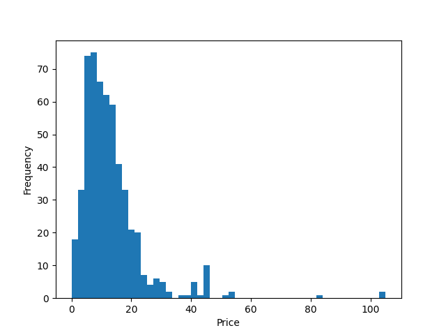
I then did the same thing, except I only used book price and changed the graph to a histogram.
# grabbing 'Price' column from data
price = data['Price']

# plotting histogram
plt.hist(price, bins = 50)

# adding x- and y- labels
plt.xlabel("Price")
plt.ylabel('Frequency')

# showing graph
plt.show()
I used 50 bins because it is a good number of bins to show the normal distribution for this amount of data. The resulting graph is pictured below.
Histogram
As you can see, Python for finance doesn't have to be mysterious, and there are many options to choose from. We hope you enjoy coding and analyzing your datasets. Let us know how it goes!
Written by William Inglish, a college student aspiring to become a Data Scientist, currently working as a software development intern at StandardUser. Connect with him here on LinkedIn.
Revised and edited by Caleb Halter, a full stack developer at StandardUser. You can find him here on LinkedIn.
Comments